This is the draft website for Programming Historian lessons under review. Do not link to these pages.
For the published site, go to https://programminghistorian.org
Contents
- Introduction
- Sample Dataset
- Building Graphs with Plotly Express
- Building Graphs with Plotly Graph Objects
- Viewing and Exporting Figures
- Summary
Introduction
Lesson Goals
This tutorial demonstrates how to create interactive data visualisations in Python using Plotly’s open-source graphing libraries. In particular, you will learn:
- The distinction between Plotly Express, Plotly’s graph objects, and Plotly Dash.
- How to create and export graphs using
plotly.expressandplotly.graph_objects. - How to add custom features to graphs.
Prerequisites
In order to follow this tutorial, it is assumed that you have:
- Installed Python 3 and the
pippackage installer - An intermediate-level understanding of the Python programming language
- Some familiarity with (and installation of) Pandas and NumPy
- Knowledge of basic data visualisation techniques (e.g. bar charts, histograms and scatterplots)
- Some familiarity with data preprocessing (we will be using Pandas in this tutorial)
This tutorial was developed using Jupyter Notebook. For those who are unfamiliar with this software, the Programming Historian offers an excellent tutorial on how to create, edit and export Jupyter notebooks here. You may also follow this tutorial using your own preferred code editor (e.g. VSCode, PyCharm etc.).
What is Plotly?
Plotly is a company which provides a number of open-source libraries allowing users to build interactive graphs. Plotly libraries are available in Python — the focus of this tutorial — as well as various programming languages, including R and Julia.1 A wide range of graphs is available through Plotly libraries, ranging from the statistical or scientific to the financial or geographic. These graphs can be displayed using various methods, including Jupyter notebooks, HTML files, and web applications produced with Plotly’s Dash framework. Static (i.e. non-interactive) graphs can also be exported either as raster or vector images.
Plotly’s Python Graphing Library: Plotly Express vs. Plotly Graph Objects vs. Dash
To understand how to use Plotly, it is vital to understand the differences between Plotly Express, Plotly Graph Objects, and Plotly Dash.
Essentially, these are three distinct — but often overlapping — Plotly modules with their own use cases:
- Plotly Express (
plotly.express, usually imported aspx) is an accessible, high-level interface for creating data visualisations, offering ~30 different graph types to users. The module provides functions which create figures in just one line of code (although more lines are required for certain customisations), making graphs quick and easy to create. Since this is a ‘high-level’ interface, users do not need to interact with the underlying data structure of graphs when usingplotly.px. Plotly recommends that new users start with Express before working directly with Plotly Graph Objects. - Plotly Graph Objects (
plotly.graph_objects, usually imported asgo) are the actual figures created and rendered by Plotly ‘under the hood’: in essence, when a user creates a figure inplotly.px, Plotly will generate a Graph Object to store the graph’s data. These data include not only the information being visualised through the graph but also attributes such as graph colours, sizes, and shapes. It is therefore possible to create visualisations at the lower-levelplotly.gomodule; in fact, it is possible to recreate anything made withplotly.pxusingplotly.go. It is generally advised to useplotly.pxwhere possible since usingplotly.gooften involves generating many lines of code, but, as we will see later, there are some specific use cases forplotly.go. - The Plotly Dash module (imported as
dash) is a framework for building interactive web applications (typically dashboards) which can be embedded into websites and other platforms. Users often integrate figures created usingplotly.pxand/orplotly.gointo their Dash apps, making the Plotly Python stack a full suite for creating, manipulating, and publishing interactive data visualisations. Plotly Dash is built on top of React.js and Plotly.js to enable integration with the web, meaning that users do not need to have any knowledge of Javascript, CSS or HTML (only Python).2
Plotly provides comprehensive documentation for working with Express and Graph Objects and for using Dash.
Why Plotly?
There are currently a plethora of graphing libraries available to Python users, including Matplotlib, Seaborn, Bokeh and Pygal. With so many options to choose from, users will need to select one library over another. Factors such as use case, stylistic taste, and ease of use will be important here, with each library having its own merits. Some of the notable advantages of working with Plotly include:
- Plotly is one of the only packages to be directed at interactive graphs: options such as Matplotlib and Pygal provide only limited interactivity (although Bokeh is also designed for interactivity and is a viable alternative).3
- Plotly is the only Python graphing suite which facilitates both the creation of graphs and the integration of these graphs within web apps.
- Plotly has easy (seamless) integration with Pandas (e.g. DataFrames can be added directly into graph objects).
- Interactive 3D graphs are available (typically not available in other libraries).
- Plotly is simple to use (e.g. adding features like animation and dropdown bars is relatively easy).
Sample Dataset
This tutorial uses Roger Lane’s ‘Homicides in Philadelphia, 1839-1932’ dataset for demonstrative purposes. The dataset and its related documents are available freely via the Historical Violence Database project organised by Ohio State University and licensed under a Creative Commons Attribution-Noncommercial-Share Alike 3.0 United States License. This tutorial will work with a subset of the data, covering only the years 1902-1932. If you wish to work along with this tutorial, scroll down to ‘Data Set 2’ and use the ‘Philadelphia homicides 1902-1932 [csv]’ dataset. (The corresponding ‘Philadelphia homicide codebook 1902-1932’ document was also consulted to verify variables in the dataset but is not required for completing this tutorial.) As its title suggests, the dataset records homicides which occurred in Philadelphia in the early twentieth century. It is informed by arrest reports filed by the Philadephia police and covers the years 1902, 1908, 1914, 1920, 1926, and 1932. In its downloaded format, the dataset contains 26 columns x 717 rows, although we will be scaling this down.
Building Graphs with Plotly Express
Setting Up Plotly Express
-
Before starting, you will need to install three modules to your environment.4 These include:
-
With these packages installed, create a new Jupyter notebook (or a new Python file in your chosen code editor). Ideally, your notebook should be stored in the same folder as the downloaded sample dataset.
-
importthese modules at the start of your new notebook:
import numpy as np
import pandas as pd
import plotly.express as px
Importing and Cleaning Data
Next, we will import and clean the Philadelphia homicide dataset using Pandas. This will involve:
- Importing only the required columns from our dataset
- Replacing any missing numeric values as a NumPy ‘non-number’ (the
NaNdata type) - Relabelling and removing certain data points for clarity and accuracy
# Import data as DataFrame (only the columns specified under 'fields' list will be kept)
fields = [
    "Year",
    "Charge",
    "Gender of accused",
    "Age of accused",
    "Victim age",
    "Weapon",
    "Gang",
]

# Store csv data as DataFrame, keeping specified columns with 'usecols' parameter
phl_crime = pd.read_csv("philadelphia homicides 1902-1932 5-2004.csv", usecols=fields)

# Replace missing numeric values (classified in original dataset as '99') to NumPy NaN
phl_crime.replace(99, np.NaN, inplace=True)

# Drop rows with where crime type is unknown (those classified as either '4' or '9' under the 'Charge' column)
phl_crime = phl_crime.drop(
    phl_crime[(phl_crime.Charge == 4) | (phl_crime.Charge == 9)].index
)

# Re-label crime types (under "Charge" column) as nouns (originally coded numerically)
phl_crime["Charge"].replace(
    {1: "Murder", 2: "Manslaughter", 3: "Abortion"}, inplace=True
)

# Re-label gender (under "Gender of accused" column) as nouns (originally coded numerically)
phl_crime["Gender of accused"].replace(
    {1: "Male", 2: "Female", 3: np.NaN, 9: np.NaN}, inplace=True
)

# Replace erroneous data and typos in "Year" column
phl_crime["Year"].replace(
    {1514: 1914, 1520: 1920, 1526: 1926, 1532: 1932, 1915: 1914}, inplace=True
)

# Re-label gang affilation (under "Gang" column) as nouns (originally coded numerically)
phl_crime["Gang"].replace({1: "No gang", 2: "Teen gang", 3: "Adult gang"}, inplace=True)

# Re-label weapons (under "Weapon" column) as nouns (originally coded numerically)
phl_crime["Weapon"].replace(
    {
        1: "Gun",
        2: "Knife, sharp instrument",
        3: "Blunt object",
        4: "Fist, other body part",
        5: "Vehicle",
        6: "Other",
        7: "Poison",
        9: np.NaN,
    },
    inplace=True,
)
Bar Charts
Now that we’ve created a Pandas DataFrame for our historical homicide data, we can start building some basic graphs using Plotly Express. Let’s begin by creating a bar chart to represent the count of prosecutions per type of crime. Since our existing dataset does not contain counts of offences (each row represents one individual prosecution), we will first need to create a new DataFrame which groups cases by offence type and provides a count:
# Creates new DataFrame containing count of prosecutions per offence type
phl_by_charge = phl_crime.groupby(["Charge"], as_index=False).size()
The next step is to create the bar chart using this new phl_by_charge dataset. Notice that the graph has been saved to the variable fig, which is a common convention when working with Plotly:
# Create bar chart using the .bar() method
fig = px.bar(phl_by_charge, x="Charge", y="size")

# Display figure using the .show() method
fig.show()
Example 1 (Embedding HTML in iframe - run mouse over the image)
Example 2 (HTML div with Plotly JS and CSS loaded in the page - run mouse over the image)
Figure 1. Murder, manslaughter and abortion charges in Philadelphia, 1902-1932)
Example 3 (Fallback Scenario, link to HTML file - click the image)
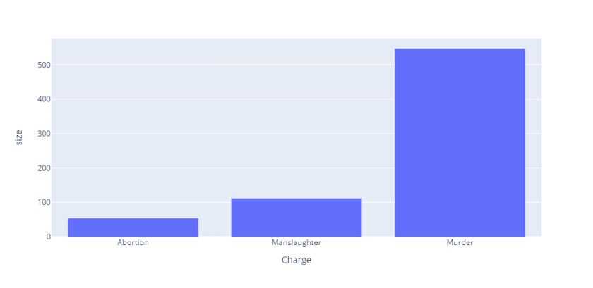
Figure 1. Murder, manslaughter and abortion charges in Philadelphia, 1902-1932)
So we have our first px graph! Notice that this graph already has some interactivity: hovering over each bar will specify its crime type and prosecution count. Another notable feature is that users can easily save this graph (as a static image) by navigating to the top-right corner and clicking on the camera icon to download the plot as a .png file.
However, this isn’t the most visually appealing graph; it could use a title, some colours, and a clearer y-axis label. We could have done this when we initially created the bar chart by passing additional arguments into the .bar() method. We can use the title argument to hard-code a title into our plot, the labels argument to change the y-axis labels from ‘size’ to ‘Count’, and the color argument to colour the bars according to a given variable (in this example we will use the crime type, “Charge”).
# Create bar chart using the .bar() method (in a new code cell)
fig = px.bar(
    phl_by_charge,
    x="Charge",
    y="size",
    title="Murder, manslaughter and abortion charges in Philadelphia, (1902-1932)",
    labels={"size": "Count"},
    color="Charge", # Note that the 'color' parameter takes the name of our column ('Charge') as a string
)

fig.show()
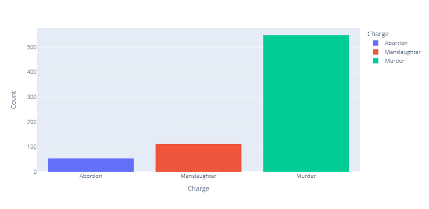
Figure 2. Murder, manslaughter and abortion charges in Philadelphia, (1902-1932)
As demonstrated above, Plotly will automatically add a legend to the graph if you are dividing attributes by colour (this can be avoided if desired). The legend is also interactive: clicking once on an element will remove its corresponding bar from the graph; double-clicking on an element will isolate all others.
Line Graphs
Let’s move on to creating a line graph. As a general rule, Plotly Express graphs are created using the syntax px.somegraph(), where somegraph represents the graph being created: for example, while we used the syntax px.bar() to create a bar chart, we will use px.line() to create a line graph. The exact term needed for each graph type can be found via the Plotly documentation.
Our line graph will illustrate changes in prosecution rates per crime type over the research period. As before, we will need to create a new DataFrame which groups cases by both year and offence type:
# Creates new DataFrame containing counts of prosecutions per offence type and year
phl_by_year = phl_crime.groupby(["Charge", "Year"],as_index=False).size()
Next, we will create a line graph using the .line() method and will use the titles, labels, and color keywords to add some formatting:
# Use px.line() to build line graph and add some formatting
fig = px.line(
    phl_by_year,
    x="Year",
    y="size",
    title="Murder, manslaughter and abortion rates in Philadelphia, (1902-1932)",
    labels={"size": "Count"},
    color="Charge",
)

fig.show()
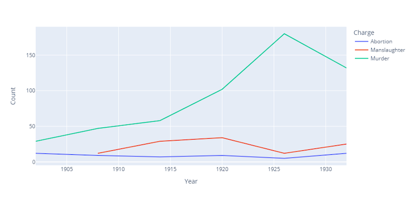
Figure 3. Murder, manslaughter and abortion rates in Philadelphia, (1902-1932)
Although we have now seen how to create new graphs with some added formatting, what if we wanted to add our formatting after creating the graph? We can use the .update_layout() method on our fig object to edit the graph at a later stage. This method can be applied to any Plotly Express graph and accepts a very wide range of adjustable parameters. As an example, let’s use the method to update our font family, font colours, and the text of our title:
fig.update_layout(
    font_family="Courier New",  # Update font
    font_color="blue",  # Make font blue
    legend_title_font_color="red",  # Make legend title red
    title="A formatted title!",
)

fig.show()
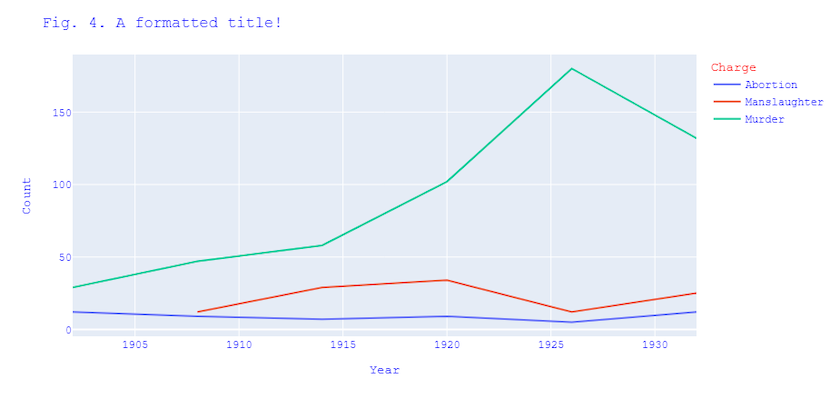
Figure 4. Caption text to display
Scatterplots
Scatterplots, commonly used for visualising relationships between continuous variables, can be created with Plotly Express using the .scatter() method. For our sample dataset, it might be appropriate to use a scatterplot to depict the relationship between victim and assailant ages.
fig = px.scatter(
    phl_crime,
    x="Age of accused",
    y="Victim age",
    color="Charge",  # Add
    title="Relationship between victim and assailant age, Philadelphia homicides (1902-1932)",
)
fig.show()
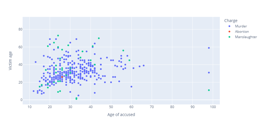
Figure 5. Relationship between victim and assailant age, Philadelphia homicides (1902-1932)
As with bar charts and line graphs, Express scatterplots contain some inherent interactivity; hovering over a unique data point will display the specific charge and the ages of both the accused and the victim. Clicking/double-clicking on the legend allows you to isolate certain elements.
Facet Plots
Facet plots are made up of the multiple subplots which a) share the same set of axes; and b) show a subset of the data (for the same set of variables). These can be made very easily in Plotly Express. First, using the same procedure as outlined in the above examples, you’ll need to specify the type of graph which you want to use in your subplots. Second, the facet_col parameter allows you to specify which variable to use for splitting the data into subplots. In the example below, a 2x1 grid of bar charts is used to illustrate counts for the types of weapons used by suspects in homicide cases, within which one bar chart provides counts for male suspects and the other for their female counterparts:
# Create DataFrame which groups by gender and weapon and adds a count ('size') column
phl_by_weapon = phl_crime.groupby(
    ["Weapon", "Gender of accused"], as_index=False
).size()

# Use px.bar() to indicate that we want to create bar charts
fig = px.bar(
    phl_by_weapon,
    x="Weapon",
    y="size",
    facet_col="Gender of accused",  # Use facet_col parameter to specify which field to split graph by
    color="Weapon",
    title="Female and male weapon use, Philadelphia homicides (1902-1932)",
)
fig.show()
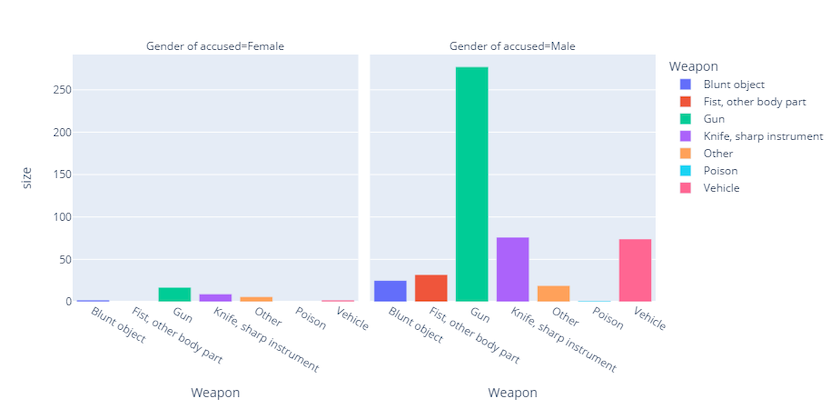
Figure 6. Female and male weapon use, Philadelphia homicides (1902-1932)
Note that this method circumvents the need to specify your grid dimensions, as Plotly Express will automatically divide the grid into the number of categories available (in this case, a 2x1 grid — one chart for males and one for females). However, the method only works for creating a figure which contains just one type of graph. We will discuss how to create figures which contain specified dimensions and multiple types of graph in the section on using Graph Objects.
Adding Animations: Animation Frames
As we have already seen, Plotly Express figures already feature some inbuilt interactivity. Yet there are a number of additional features which can be added for increased interactivity, two of which will be covered here: animation frames and dropdown bars.
An animation frame depicts the way data change in relation to a certain measure. In historical research, the most likely measure to be useful is time, although most other numerical variables with some inherent rankability (e.g. ordinal or interval data) should work. A Plotly Express figure with an animation frame will contain an interactive toolbar which allows users not only to play/stop the animation but also to manually scroll to the data dispersion at selected points.
To create a figure with an animation frame, start by using the usual method outlined in the above examples to specify which type of graph is desired. Then, within that method, use the animation_frame parameter to specify which variable should be used for visualising change. The example below builds a bar chart depicting changes in male and female homicide prosecutions over the sample period:
# Create DataFrame which provides counts of prosecutions by gender and year
phl_by_gender_year = phl_crime.groupby(
    ["Gender of accused", "Year"], as_index=False
).size()

# Use px.bar() to create a bar chart
fig = px.bar(
    phl_by_gender_year,
    x="Gender of accused",
    y="size",
    labels={"size": "Count"},
    range_y=[
        0,
        200,
    ],  # The range_y parameter allows customization of the y-axis range (optional)
    color="Gender of accused",
    title="Male and female homicide charges, Philadelphia (1902-1932)",
    animation_frame="Year", # Use the animation_frame to specify which variable to measure for change
)
fig.show()
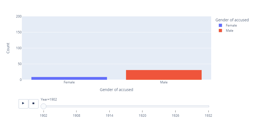
Figure 7. Male and female homicide charges, Philadelphia (1902-1932)
Adding Animations: Dropdown Bars
Dropdown bars can also be added to Plotly Express figures, although are more complicated than adding an animation frame. They can allow users to switch between a wide variety of display options, including changing colours, lines, axes and even variables. In our first example, we will be using a dropdown bar to switch between two different types of graph (a stacked bar chart and pie chart).
Example 1: Switching between types of graph
When creating figures with dropdown bars, the first step is to create the initial graph without a dropdown bar (i.e. the first graph which your users will see). We’ll begin by creating a stacked bar chart showing counts of weapon use by male and female homicide suspects:
# Create stacked bar chart showing counts per weapon use
fig = px.bar(
    phl_by_weapon,  # Reusing this DataFrame as created in the facet plot example
    x=phl_by_weapon["Weapon"],
    y=phl_by_weapon["size"],
    color="Gender of accused",  # The 'color' variable specifies which variable to 'stack' the bars by
    title="Weapons used in homicides, Philadelphia (1902-1932)",
    labels={"size": "Count"},
)
Note that the graph (Fig. 6) has been created but is not visible since we have not used the fig.show() command yet. This figure will be displayed once we have added a dropdown bar in the following steps.
After creating our initial graph, the update_layout method (discussed in an earlier example) can be used to add a dropdown bar. This is a more complex step since Plotly Express objects’ data are nested at many levels under the hood and we’ll need to go a few layers deeper than normal to access the dropdown feature.
Once we have called the update_layout method:
- We first need to access the
updatemenusparameter: this stores a list of dictionaries, each dictionary storing metadata for various design features. - The only design feature we are currently interested in is the dropdown box, which is stored under the
buttonsdictionary. - The
buttonskey stores as its value another list of dictionaries, where each dictionary represents each ‘option’ available on your dropdown bar. - We’ll need to create two ‘buttons’ — one for the stacked bar chart and one for the pie chart — so our
buttonslist will store two dictionaries. - Each of these two dictionaries will need three key-value pairs:
- The first, under the
argskey, will specify which type of graph to display. - The second, under the
labelkey, will specify the text to display in the dropdown bar. - The third, under the
methodkey, will specify how to modify the chart (e.g. update, restyle, animate etc.).
- The first, under the
Following these steps, we will be able to add a dropdown bar to toggle between a bar chart and pie chart depicting weapon use in Philadelphia homicides. By default, Plotly Express will position the dropdown bar in the top-left of the figure.
Let’s take a look at this in practice:
# Use update_layout() method to add dropdown bar
fig.update_layout(
    updatemenus=[
        dict(
            buttons=list(
                [  # The 'buttons' parameter stores a dictionary for each 'option' in the dropdown bar
                    dict(
                        args=[
                            "type",
                            "bar",
                        ],  # Our first button will create chart of type 'bar'
                        label="Bar chart",
                        method="restyle",
                    ),
                    dict(
                        args=[
                            "type",
                            "pie",
                        ],  # Our second button will create chart of type 'pie'
                        label="Pie chart",
                        method="restyle",  # We use the 'restyle' method here as we are modifying the data
                    ),
                ]
            )
        )
    ]
)

fig.show()
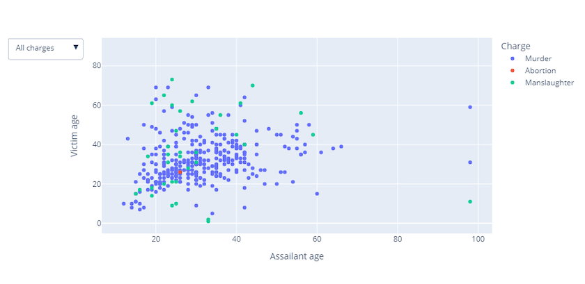
Figure 8. Weapon use in Philadelphia homicides (1902-1932)
Example 2: Switching between categories
In this example, we will look at how to use a dropdown bar to toggle between different categories of a variable. We’ll create a scatterplot to display the ages of the accused and their victims and add a dropdown bar which allows users to see data points for either a) all cases, b) murder charges only, c) manslaughter charges only, or d) abortion charges only.
We begin by creating our initial graph (the first scatterplot which the audience sees). As before, we will only create the graph at this stage; the figure will be displayed after we have added the dropdown bar.
fig = px.scatter(
    phl_crime,
    x="Age of accused",
    y="Victim age",
    color="Charge",
    title="Fig. 8. Relationship between victim and assailant age, Philadelphia homicides (1902-1932)",
    labels={"Age of accused": "Assailant age"},
)
The dropdrown bar can then be created using the update_layout method and creating the updatemenus list of dictionaries. The buttons list of dictionaries will then be nested under updatemenus, with each dictionary again representing a unique option in the dropdown bar. However, the dictionaries within the buttons list require different key-value pairs to those in the previous example because we are not changing a graph type here (as in the above) but are actually filtering out data in the same graph. The key-value pairs needed are:
- Under the
labelkey, the value will specify the text to display in the dropdown bar. - Under the
methodkey, the value will be ‘update’ since we are altering the layout and the data. - Under the
argskey, the value (which is another list of dictionaries) will specify a) which data will be ‘visible’ (more on this issue below), b) the title for this graph view (optional), c) the titles for the x- and y-axes of this graph view (optional).
A list needs to be entered for the visible key, where each item in the list indicates whether the data at that index should be displayed. In our example, we have partitioned our dataset into three groups: the data corresponding to murder charges, the data for the manslaughter charges, and the data for the abortion charges. As such, our list for the visible key should have three items. Our first ‘button’ which represents the first graph displayed to the user, should therefore specify [True, True, True] since we want all charges to be shown in that first view. However, the remaining three ‘buttons’ will only have one item as True because we want to only show the data for one type of crime here.
Again, let’s put this into practice:
# Use .update_layout() method to add dropdown bar
fig.update_layout(
    updatemenus=[
        dict(
            buttons=list(
                [  # Create the 'buttons' list to store a dictionary for each dropdown option
                    dict(
                        label="All charges",  # Add label for first 'view'
                        method="update",
                        args=[
                            {
                                "visible": [True, True, True]
                            },  # This 'view' show all three types of crime
                            {
                                "title": "Victim and assailant ages, Philadelphia homicides (1902-1932)",
                                "xaxis": {"title": "Age of accused"},
                                "yaxis": {"title": "Victim age"},
                            },
                        ],
                    ),
                    dict(
                        label="Murder",  # Add label for second 'view'
                        method="update",
                        args=[
                            {
                                "visible": [True, False, False]
                            },  # Will only show data for first item (murder)
                            {
                                "title": "Dynamic title: victim and assailant ages in murder charges",  # Can change titles here to make the graph more dynamic
                                "xaxis": {
                                    "title": "Dynamic label: age of accused"
                                },  # As above
                                "yaxis": {"title": "Dynamic label: victim age"},
                            },
                        ],
                    ),  # As above
                    dict(
                        label="Manslaughter",  # Add label for third 'view'
                        method="update",
                        args=[
                            {
                                "visible": [False, False, True]
                            },  # Will only show data for second item (manslaughter)
                            {
                                "title": "Another dynamic title: victim and assailant in manslaughter charges",  # New title
                                "xaxis": {
                                    "title": "Another dynamic label: age of accused"
                                },  # New x- and y-axis titles
                                "yaxis": {"title": "Another dynamic label: victim age"},
                            },
                        ],
                    ),
                    dict(
                        label="Abortion",  # Add label for fourth 'view'
                        method="update",
                        args=[
                            {
                                "visible": [False, True, False]
                            },  # Will only show data for third item (abortion)
                            {
                                "title": "More dynamism: ages of accused and victims in abortion charges",  # New title
                                "xaxis": {
                                    "title": "More dynamism: age of accused"
                                },  # New x- and y-axes titles
                                "yaxis": {"title": "More dynamism: victim age"},
                            },
                        ],
                    ),
                ]
            )
        )
    ]
)

fig.show()
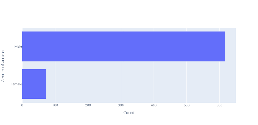
Figure 9. Relationship between victim and assailant age, Philadelphia homicides (1902-1932)
Creating the dropdown bar in the above example provides users with the ability to isolate (and examine) a given element from the wider visualisation, a Plotly feature which we visited earlier in the tutorial when noting that double-clicking on an element in the graph’s legend will remove it from the visualisation (¶18). However, the dropdown menu offers an additional advantage: it provides us with the ability to create dynamic headings, where our titles and labels can change depending on which option we have selected from the dropdown box. Take another look at the figure above, but this time pay attention to the way that the titles and axis-labels change as you select different options!
The above examples demonstrate that it is very easy to create graphs using Plotly Express and relatively simple to add interactivity such as animation frames and dropdown bars. Having thus provided an overview of Plotly Express, we will now look at creating graphs with Plotly Graph Objects. Specifically, we will focus on what ‘Graph Objects’ are, how they work, and when (and why) you might want to create graphs using plotly.go instead of plotly.px.
Building Graphs with Plotly Graph Objects
Setting Up Plotly Graph Objects
To start working with Plotly’s Graph Objects, you’ll need to import the graph_objects module:
import plotly.graph_objects as go
from plotly.graph_objs.scatter.marker import Line # Not required, but avoids raising 'DeprecationWarning'.
They’re All Objects! Data Structure of Plotly Graph Objects
As mentioned in the introduction to this tutorial, all Plotly Express figures are actually Graph Objects ‘under the hood’. This means that, when you create a figure using plotly.px, you are creating an instance of a Graph Object.
This becomes evident if we call the type function on the fig variable which we created for Figure 7 above:
# Output the figure's 'type'
print(type(fig))

# <class 'plotly.graph_objs._figure.Figure'>
It is important to note therefore that all figures created in Plotly are effectively Graph Objects.
Graph objects are represented by tree-like (hierarchical) data structures with three top levels: data, layout, and frames:
- The
datalevel contains information such as the ‘type’ of chart, the ‘categories’ available, the data points falling under each ‘category’, whether to show the category in the legend, the types of markers being used for data points, and the text/data to display when hovering over data points. - The
layoutattribute contains information such as the figure dimensions, the fonts and colours used, any annotations, the coordinates of subplots, the metadata associated with anybuttons(as discussed in a previous example), and whether any images should be used in the background. - The
framesattribute stores information relating to animations used in the figure, such as the data to be displayed at each ‘stop’ point on a sliding bar. This attribute will not be created unless you add an animation to the figure.
It is easy to view the underlying data structure of a figure by printing it as a Python dictionary with the fig.to_dict() function. We can format the structure for easier reading by viewing it in JSON format with fig.to_json(pretty=True). In the example below, we display only the first 500 characters to provide a sample of the output when we use this method (again using the fig variable we created above).
# print(fig.to_dict())
print(fig.to_json(pretty=True)[0:500] + "\n...")
{
  "data": [
    {
      "hovertemplate": "\u003cb\u003eGender=\u003c\u002fb\u003e %{x}\u003cbr\u003e\u003cb\u003eCount=\u003c\u002fb\u003e %{y}\u003cextra\u003e\u003c\u002fextra\u003e",
      "name": "Suspect gender",
      "x": [
        "Female",
        "Male"
      ],
      "y": [
        72,
        617
      ],
      "type": "bar",
      "xaxis": "x",
      "yaxis": "y"
    },
    {
      "hovertemplate": "\u003cb\u003eGender=\u003c\u002fb\u003eFemale\u003cbr\u003e\u003cb\u003eYear=\u003c"
    }
  ]
}
Examining the output of a figure should help you to understand the underlying data structure and properties of a graph object. If you print the full output (using the fig.to_dict() method referenced above), you will notice that:
- Our
dataattribute stores data for each of the three categories (murder, manslaughter, and abortion) under separate dictionaries. - The
dataattribute qualifies which type of graph is being used (in this case ‘scatter’). - The
layoutattribute contains the figure title. - The
layoutattribute contains the data associated with thebuttons(i.e. the dropdown bar). - There is no
tracesattribute since there is no animation frame associated with this figure.
Using Plotly Graph Objects vs. Plotly Express
In addition to the underlying data structure, another key point to be aware of is that creating graphs with plotly.go typically requires much more code than making the same graph with plotly.px.
Consider the following example of building a simple horizontal bar chart to show male vs. female homicide prosecutions. First, let’s create a DataFrame which tallies prosecution counts by gender:
phl_by_gender=phl_crime.groupby(["Gender of accused"], as_index=False).size()
Now let’s build the horizontal bar chart with these data with plotly.go:
fig = go.Figure(
    go.Bar(x=phl_by_gender["size"],  # Use go.Bar() to specify chart type as bar chart
           y=phl_by_gender["Gender of accused"],
    orientation='h',
    hovertemplate="Gender=%{y}<br>Count=%{x}<extra></extra>"), # Need to format hover text (this is automatic with plotly.px)
    layout={"title": "Fig. 9. Gender of accused graph, made with plotly.graph_objects"})

fig.update_layout(  # Need to use .update_layout to add x- and y-axis labels (this is automatic with plotly.px)
    xaxis=dict(title="Count"),
    yaxis=dict(title="Gender of accused"))

fig.show()
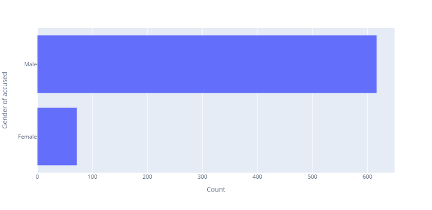
Figure 10. Gender of accused, made with Graph Objects
Now let’s create the same figure using plotly.px:
fig = px.bar(
    phl_by_gender,
    x="size",
    y="Gender of accused",
    orientation="h",
    title="Fig. 10. Gender of accused graph, made with plotly.express",
    labels={"size": "Count"},
)

fig.show()
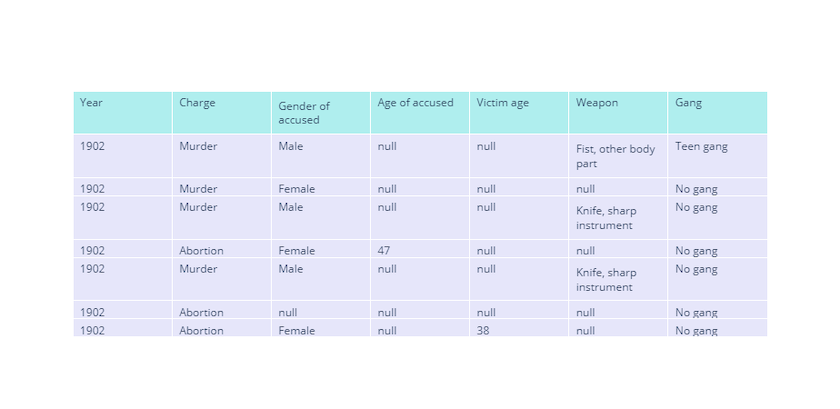
Figure 10. Gender of accused, made with Plotly Express
It becomes clear from the above examples that plotly.go requires more code than plotly.px due to the fact that some features which are automatically built into plotly.px figures need to be manually created when using plotly.go. As a result of this shortcoming, it is desirable to use plotly.px where possible.
Why Use Graph Objects?
This leads us to a key question: if it’s so much easier to create graphs using plotly.px, why should we bother using plotly.go at all? The simple answer is that there are several useful features and capabilities which are only available by using plotly.go. We will look at two such capabilities in this section of the tutorial: tables and subplots.
Tables
One of the most useful features provided through the plotly.go module is the option to create neat, interactive tables. Four steps are required to create a table:
- Create a new figure using the
.Figure()method. - Under the
dataattribute, call the.Table()method to specify that the figure should be a table. - Within the
.Table()method, create aheaderdictionary to store a list of column headings. - Also within the
.Table()method, create acellsdictionary to store the data (values).
It is also possible to add customisation such as labels, colours and alignment.
In the below example, we’ll create a table to store the entire Philadelphia homicides dataset:
fig = go.Figure(
    data=[
        go.Table(  # Create table
            header=dict(
                values=list(
                    phl_crime.columns
                ),  # Get list of all columns in 'phl_crime' DataFrame to use for header
                fill_color="paleturquoise",  # Change heading colour
                align="left",
            ),  # Change header text alignment
            cells=dict(
                values=phl_crime.transpose().values.tolist(),  # Get values from all columns in dataframe for values
                fill_color="lavender",
                align="left",
            ),
        )
    ]
)

fig.show()
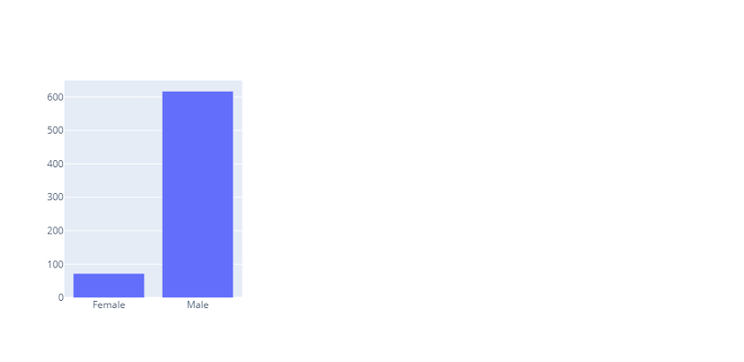
Figure 12. Table of Philadelphia Homicides dataset
As with plotly.px, figures created with plotly.go have some inherent interactivity. Tables, for example, provide users the ability to scroll through rows (either using a trackpad or the scrollbar on the right) and are therefore excellent for saving space. It is also possible to move columns around by clicking at the column header and dragging left/right.
Subplots
Another useful feature of the plotly.go module is its capacity for building subplots. It was demonstrated earlier that plotly.px provides the ability to build facet plots, yet these are limited in that they must share the same graph type, axes and variables. With subplots, meanwhile, it is possible to create a grid containing different types of graphs with their own axes and variables. As such, these can be viewed as a sort of ‘dashboard’.
Since the code is particularly lengthy for creating subplots, this example will be provided on a step-by-step basis. The example will create a 3x1 grid containing three different charts: the first will be a standard bar chart to quantify prosecutions counts for male vs. female suspects; the second will be a line graph showing changes in male vs. female prosecutions over time; and the third will be a boxplot showing the minimum, inter-quartile range and maximum ages of male vs. female suspects.
Step 1: Import subplots module and get data
# Import make_subplots
from plotly.subplots import make_subplots

# Gather data for subplot
phl_women, phl_men = (
    phl_crime.loc[phl_crime["Gender of accused"] == "Female"],
    phl_crime.loc[phl_crime["Gender of accused"] == "Male"],
)
phl_women_year, phl_men_year = (
    phl_women.groupby(["Year"], as_index=False).size(),
    phl_men.groupby(["Year"], as_index=False).size(),
)
Step 2: Create an empty subplot with a 3x1 grid using make_subplots() function
fig = make_subplots(rows=1, cols=3) # Use the rows and cols parameters to create smaller/bigger grid
Step 3: Add first graph (the bar chart) using .add_trace() method
fig.add_trace(
    # Use go.Bar() to specify chart type as bar chart
    go.Bar(
        x=phl_by_gender[
            "Gender of accused"
        ],
        y=phl_by_gender["size"],
        name="Suspect gender",
        hovertemplate="<b>Gender=</b> %{x}<br><b>Count=</b> %{y}<extra></extra>",
    ),
    # Use the row and col parameters to change the position of the subplot within the grid
    row=1,
    col=1,
)
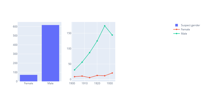
Figure 13. Gender of accused with subplots
Step 4: Add second graph (the line graph)
Note that this step will raise a DeprecationWarning but will not cause an error.
fig.add_trace(
    # Use go.Line() here to specify graph type as line graph
    go.Line(
        x=phl_women_year[
            "Year"
        ],
        y=phl_women_year["size"],
        name="Female",  # Specify that this line represents female prosecutions
        hovertemplate="<b>Gender=</b>Female<br><b>Year=</b> %{x}<br><b>Count=</b> %{y}</b><extra></extra>",
    ),
    # the col parameter is now 2 (rather than 1) since we want to position this graph next to the bar chart.
    row=1,
    col=2,
)

# Since we want separate lines for male and female charges, we need to add two 'Line' traces to the plot.
fig.add_trace(
    go.Line(
        x=phl_men_year["Year"],
        y=phl_men_year["size"],
        name="Male",  # Specify that this line represents male prosecutions
        hovertemplate="<b>Gender=</b>Male<br><b>Year=</b> %{x}<br><b>Count=</b> %{y}</b><extra></extra>",
    ),
    row=1,
    col=2,
)
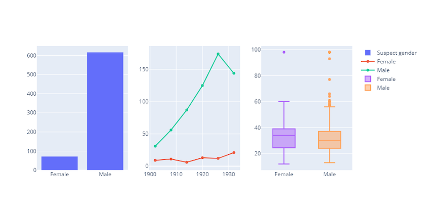
Figure 13. Gender of accused with subplots with line graph
/Library/Frameworks/Python.framework/Versions/3.10/lib/python3.10/site-packages/plotly/graph_objs/_deprecations.py:378: DeprecationWarning:

plotly.graph_objs.Line is deprecated.
Please replace it with one of the following more specific types
    - plotly.graph_objs.scatter.Line
    - plotly.graph_objs.layout.shape.Line
    - etc.
Step 5: Add final graph (the boxplot)
We have not looked at boxplots yet, but they are created in a similar way to other graphs and have similar interactive behaviour (e.g. scrolling over a box will show the min, max, median, and interquartile range of the data).
fig.add_trace(
    # Use go.Box() to specify graph type as boxplot
    go.Box(
        y=phl_women["Age of accused"], name="Female"
    ),
    row=1,
    col=3, # col=3 now because it is the third graph in the grid figure
)

# As before, we need to add another trace since we want a separate box for males.
fig.add_trace(go.Box(y=phl_men["Age of accused"], name="Male"), row=1, col=3)

Figure 13. Gender of accused subplots with box plot
Step 6: Format figure
There are still some tweaks needed, such as adding a main title and a subtitle for each subplot. It’s also possible to change fonts, text positioning, and the figure size. The .update_layout() method can be used to change such properties:
fig.update_layout(
    font_family="Times New Roman",  # Change font for the figure
    hoverlabel_font_family="Times New Roman",  # Change font for hover labels
    hoverlabel_font_size=16,  # Change font size for hover labels
    title_text="Bar, box and line subplots: male vs. female homicide charges, Philadelphia (1902-1932)",  # Main title
    title_x=0.5,  # Position main title at center of graph (note: the title_x parameter only takes integers or floats)
    xaxis1_title_text="Suspect gender",  # Add label for x-axis in 1st subplot
    yaxis1_title_text="Count",  # Add label for y-axis in 1st subplot
    xaxis2_title_text="Year",
    yaxis2_title_text="Count",
    xaxis3_title_text="Suspect gender",
    yaxis3_title_text="Age",
    showlegend=False,  # Remove legend
    height=650, # Set height for graph - not needed, but can be useful for digital publishing
)
Figure 16. Bar, box and line subplots: male vs. female homicide charges, Philadelphia (1902-1932)
Step 7: Add annotations to line graph
Since the legend has been removed, it’s now impossible to distinguish between which lines represent males and females in the line graph. This can be avoided by using the .update_layout() method to add arrows with annotations:
fig.update_layout(
    # Pass in a list of dicts where each dict represents one annotation
    annotations=[
        # Our first annotation will be for the 'males' line
        dict(
            x=1920,
            y=120,  # X- and y- co-ordinates for the annotation point
            xref="x2",  # Specify xref and yref as x2 and y2 because we want the second graph in the grid (the line graph)
            yref="y2",
            text="Males",  # Text for annotation is 'Males'
            showarrow=True,  # Use False to add a line without an arrowhead
            arrowhead=1,  # Change size of arrowhead
            ax=30,  # Use the ax and ay parameters to change length of line
            ay=30,
        ),
        # Our second annotation will be for the 'females' line
        dict(
            x=1920,
            y=20,
            xref="x2",
            yref="y2",
            text="Females",
            showarrow=True,
            arrowhead=1,
        ),
    ]
)
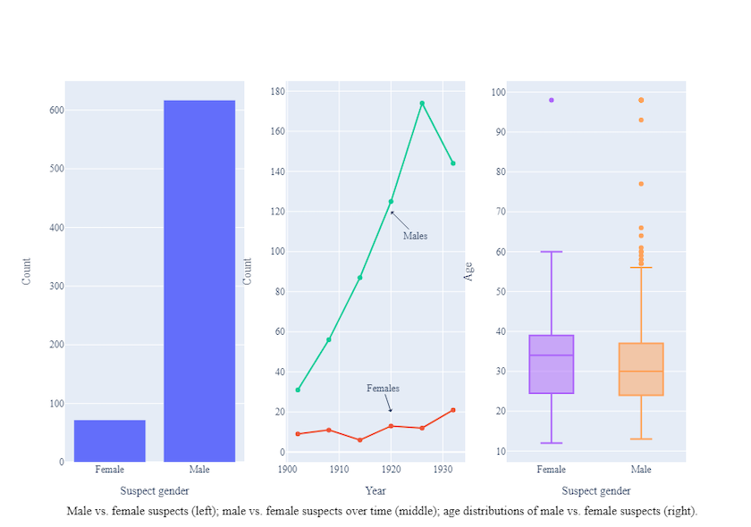
Figure 17. Bar, box and line subplots: male vs. female homicide charges, Philadelphia (1902-1932), with annotations added to the line graph
Step 8: Add annotation below the figure
We might want to add an annotation below the figure to specify the focus of each subplot (particularly useful for academic publishing). This can be performed with the .add_annotation() method:
fig.add_annotation(
    dict(
        font=dict(color="black", size=15),  # Change font colour and size
        x=0,  # Use x and y to specify annotation position
        y=-0.15,
        showarrow=False,
        text="Male vs. female suspects (left); male vs. female suspects over time (middle); age distributions of male vs. female suspects (right).",
        textangle=0,  # Option to rotate text (sometimes useful to save space)
        xanchor="left",
        xref="paper",  # Set xref and yref to 'paper' so that x and y coordinates are absolute refs.
        yref="paper",
    )
)

Figure 18. Bar, box and line subplots: male vs. female homicide charges, Philadelphia (1902-1932), with annotations below the figure
Viewing and Exporting Figures
In the previous sections of the tutorial, we have seen how to create and modify interactive graphs using both the plotly.px and plotly.go modules. We will next consider how to view and export these graphs for publications and/or other research outputs.
The methods discussed here will use a basic line graph identical to that created earlier in the tutorial (Fig. 2). Let’s start by recreating that figure:
fig = px.line(
    phl_by_year,
    x="Year",
    y="size",
    title="Murder, manslaughter and abortion rates in Philadelphia, (1902-1932)",
    labels={"size": "Count",},
    color="Charge",
)
Viewing Figures
As we have seen throughout this tutorial, the .show() method can be used to output a figure. By default, this method uses the inbuilt Plotly renderer and therefore provides interactivity:
fig.show()
Figure 19. Bar chart: Murder, manslaughter and abortion charges in Philadelphia, 1902-1932) (reproduced from Figure 1)
Exporting Figures
Plotly figures can be exported either as interactive or static (i.e. non-interactive) graphs. Interactive graphs may be useful for research websites and (some) digital publications whereas static graphs are appropriate for print publications.
Exporting as HTML
Exporting figures as HTML retains their interactivity when viewed in any web browser. Any figure can be saved as an HTML file by using the .write_html() method:
# Save HTML file of the graph (which we have been storing under the variable name 'fig' throughout this tutorial)
fig.write_html("your_file_name.html")
By default, any exported figures will be saved in the same folder as that in which your script is stored. If you want to store the figure elsewhere (e.g. a different folder), you can specify the exact directory when you specify the file name (e.g. fig.write_html("your_path/your_file_name.html")).
Exporting static images
Plotly provides numerous options for exporting both raster images (e.g. .png or .jpg) and vector images (e.g. .pdf or .svg). These can be exported by using the .write_image() function and specifying the image type within the file name:
# Export to raster graphic, either png or jpg:
fig.write_image("your_file_name.png")
fig.write_image("your_file_name.jpeg")

# Export to vector graphic, either pdf or svg:
fig.write_image("your_file_name.svg")
fig.write_image("your_file_name.pdf")
Summary
Plotly offers the ability to create publication-quality and/or interactive figures using Python and other programming languages. This tutorial therefore provides an overview of what Plotly is, why it’s useful, and how it can be used with Python. It has also demonstrated the different modules provided by the Plotly framework (Plotly Express and Plotly Graph Objects) and the methods required to create, edit, and export data visualisations. The key syntaxes covered in this tutorial include:
- Installing Plotly using
pip install plotly - Importing Plotly Express and Plotly Graph Objects using
import plotly.express as pxandimport plotly.graph_objects as go - With Plotly Express:
- Creating graphs using
px.bar(),px.line(), andpx.scatter() - Adding features to graphs using parameters such as
title,labels,color, andanimation_frame - Using
.update_layout()to edit figures after creation and/or add dropdown bars
- Creating graphs using
- With Plotly Graph Objects:
- Recognising the
data,layout, andtracesattributes as key underlying structure of a graph object - Creating new (empty) graph objects with
go.Figure() - Creating graphs using
go.Bar(),go.Table(),go.Line(), andgo.Box() - Editing features using the
layoutattribute - Creating subplots (importing the subplots module using
from plotly.subplots import make_subplots, implementing subplots withmake_subplots()function, and adding traces to subplots using.add_trace()method) - Using
.update_layout()to edit figures after creation
- Recognising the
- Exporting figures created with Express or Graph Objects using
.write_html()and.write_image()
ENDNOTES
-
Under the hood, these libraries are built on top of the Plotly JavaScript library. ↩
-
Plotly Dash is outside the scope of this tutorial, which instead focuses on
plotly.pxandplotly.go. ↩ -
For further information on Bokeh, see Charlie Harper’s tutorial on ‘Visualising Data with Bokeh and Pandas’ here on Programming Historian. ↩
-
If you already work with Jupyter notebooks, there is a good chance that other dependencies are already installed. However, if you are working in a clean Python environment or in code editor like VS Code, it may also be necessary to run
pip install ipykernelandpip install nbformat. ↩ -
We will also be using the NumPy module, but this is automatically installed with the installation of Pandas. ↩
-
Kaleido is a Python library for generating static images (e.g. jpg and SVG files) and will therefore be needed when exporting (non-interactive) graphs. ↩